• Our software update is now concluded. You will need to reset your password to log in. In order to do this, you will have to click "Log in" in the top right corner and then "Forgot your password?".
  • Welcome to PokéCommunity! Register now and join one of the best fan communities on the 'net to talk Pokémon and more! We are not affiliated with The Pokémon Company or Nintendo.

Itistheriz's Fakemon

29
Posts
14
Years
    • Seen Jun 1, 2011
    EDIT (May 3rd): Now shows all sprites so far front and back.

    Hi guys, working on a fire red hack and wanted to show off the pokemon I've made so far

    Btw, I'm going to completely redo the starters and a couple of the ones right after, but just wanted to get some criticism.

    FrontSheet.png


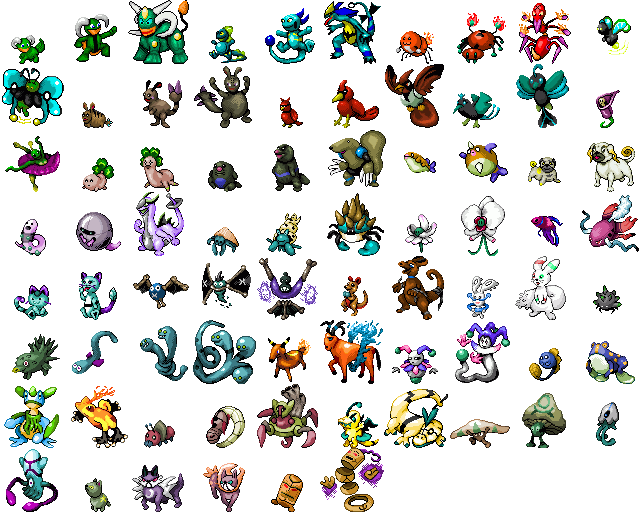
    My favorites so far are Tripeveel (the 3 headed eel at the bottom), Lukid (The clover pokemon), Betalpha (Beta fish) and Pugurrent (the pug pokemon)

    Here are the backsprites as well:
    BackSheet.png


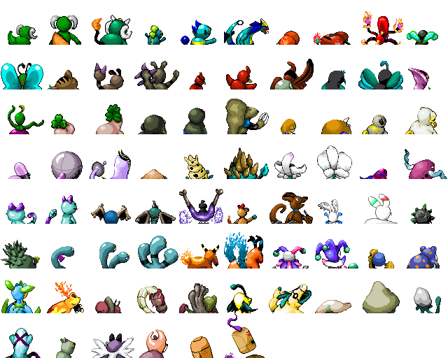
    Also, I'm having trouble coming up with psychic types, so if anybody has some ideas, let me know.
     
    Last edited:

    gol

    72
    Posts
    14
    Years
    • Seen Oct 8, 2010
    I like your sprites. Some are really good others are a little flat (namely the last one) and some have too much shading, yes, too much IMO. Pokemon Shades should have 3-4 shade colors, and some of yours have 5 or 6. I also notice one fatal flaw: most of these are straight-up paint default colors or slight variations, that is big no-no. They look better when you make your own pallete (if you don't know how just pm me and I'll tell you) or use another pokemons. Your good, keep spriting, get better!
     

    Conan Edogawa

    One Truth Prevails
    1,061
    Posts
    15
    Years
  • I like the concepts, but your shading needs work. I'm assuming you want them to be like official sprites, so I'll give my advice in that manner. Your shading should always come from the top left; on several of your sprites it comes from other various places. Also, since your hack is fire red, you should keep it to one light source, the one in the top left. Another thing I noticed is you dither a lot. Dithering is a great technique to use, but you used it way to often and it detracts from your sprites. And lastly, avoid pillow shading. You used it most noticeably on your third sprite in. Again, I really like your concepts, and the palettes are good for the most part, you just need to work on your shading.
     
    29
    Posts
    14
    Years
    • Seen Jun 1, 2011
    Thanks for the comments, guys!

    Like I said, I'm gonna redo all the starters eventually, but I'm getting much better as I'm going along.

    Here's a psychic type I just made, Jestoy and Jestyrant:
    jesters.png


    Let me know what you think!
     

    gol

    72
    Posts
    14
    Years
    • Seen Oct 8, 2010
    THE FROGS ARE EPIC! The fire one I like the best, but there is a light green in his back sprite. Oh, and you stopped using default colors. YAH! Oh, and for the bug basic pokemon's back sprite, his butt is up higher then his head... it's kinda weird. The back sprite of bug stage 2 is really cool and innovative, nice work. Oh, and what Conan said as some more critique:
    Your shading should always come from the top left; on several of your sprites it comes from other various places.
    Since you're probably trying to be official. keep spriting! :)
     
    29
    Posts
    14
    Years
    • Seen Jun 1, 2011
    Would you feel it ok if i used some of these pokemon in my hack?

    To be completely honest, I would prefer if you didn't, since these are all new ones I'm gonna put in my hack, which I haven't finished yet.

    In all honesty, though, it's not like any of the fakemon on the internet are copyrighted, so I guess there's no way to stop you.

    I am honored though that you like them enough to want to use them.
    I would prefer if you waited until I finished my hack first, so the pokemon can have the intended movesets/abilities I have in mind for them.

    Also, does anyone here know how to make a pokemon evolve by leveling up with a certain item? I use YAPE, so I can't find an option for it.

    Also, is there any point to the level up at night/day options since emulators aren't really running the day night system correctly?

    THE FROGS ARE EPIC! The fire one I like the best, but there is a light green in his back sprite. Oh, and you stopped using default colors. YAH! Oh, and for the bug basic pokemon's back sprite, his butt is up higher then his head... it's kinda weird. The back sprite of bug stage 2 is really cool and innovative, nice work. Oh, and what Conan said as some more critique: Since you're probably trying to be official. keep spriting! :)

    Yeah, the green spot isn't there in game, just a mistake I made when uploading them to imageshack.

    The tadpole levels up into the first frog, which then either levels up to the third or evolves to the fourth with a fire stone.

    My dragon/electric I did today, Volgan and Ramugron:
    volganrumgron.png
     
    Last edited:

    gol

    72
    Posts
    14
    Years
    • Seen Oct 8, 2010
    Yeah the frog evolution thing is what I thought it would be. the new dragons have a bland pallete, the yellow is really ugly, as if the coloring is from a generation 1 or 2 game. I don't know if that was intended. I really like the concept though!
     
    29
    Posts
    14
    Years
    • Seen Jun 1, 2011
    Yeah the frog evolution thing is what I thought it would be. the new dragons have a bland pallete, the yellow is really ugly, as if the coloring is from a generation 1 or 2 game. I don't know if that was intended. I really like the concept though!

    It's funny because it's basically pikachu's palette from 3rd gen.
     

    gol

    72
    Posts
    14
    Years
    • Seen Oct 8, 2010
    It's funny because it's basically pikachu's palette from 3rd gen.

    Wow.............................. Pallete choice fail! :\ How 'bout you use someone like Ampharos? It has better less pale Yellows.
     
    29
    Posts
    14
    Years
    • Seen Jun 1, 2011
    7new2.png

    Takeshi, Sporetaki, Squink, Sunkwid, Lobay, Lunobo, Solobo

    Hope you guys like!
     

    The Original Darkwiz787

    Stuck with text below my name.
    317
    Posts
    15
    Years
    • Seen Jun 24, 2014
    Your using WAY to much shading... Remember, Pokemon never use more than 16 colors (And that includes the Transparent Backround Color, Black and White, so it's really more like 13), and that's only on the really complicated ones.
     
    Last edited:
    29
    Posts
    14
    Years
    • Seen Jun 1, 2011
    Your using WAY to much shading... Remember, Pokemon never use more than 16 colors (And that includes the Transparent Backround Color, Black and White, so it's really more like 13), and that's only on the really complicated ones.

    There's only one of my sprites that has 15 colors.
    The rest are only 8-9. They are all already indexed.

    I would love to hear some positive comments for once.
    This isn't the place for me. Gol's comments are really negative, coming from someone who's made a few splices and has a terrible looking monkey fakemon and gastly ripoffs.

    I'm sick of this. This community is awful.
     
    13,131
    Posts
    19
    Years
  • Considering the current sprite forum rules, I don't think they're doing it to be horrible, they're just giving their opinion on the pieces. :) Please try not to take it too personally (although yeah, something more than "it's bad" would be nice).

    My own opinion: you do have a pretty strong idea of how to make decent sprites. I definitely see a lot of potential here.

    Biggest thing I would suggest is to experiment with your color palettes a bit more - though some of them you do have some really nice colors to them, for example:


    These are probably my favorite of what you've shown so far.

    A lot of these sprites, while they're neat ideas, seem to fall victim to being too..."gray", I suppose; try to avoid using gray as a shade if possible, also avoid using what are just darker shades of the base color (especially if it's for a yellow thing, such as those electric dragons above. Pale yellow to slightly darker yellow makes for a horrible value contrast). Try putting a tiny bit of another color into the shading - perhaps the tiniest bit of blue or purple - and see where you can go from there.

    Kinda like how Nintendo does its own pokemon sprites...the shading on those is rarely just a straight darker value, but the hue's been shifted slightly as well.

    Other than that, aside from a few other things that would probably be worked out while working on sprites some more, I definitely like what I see. :)
     
    29
    Posts
    14
    Years
    • Seen Jun 1, 2011
    Considering the current sprite forum rules, I don't think they're doing it to be horrible, they're just giving their opinion on the pieces. :) Please try not to take it too personally (although yeah, something more than "it's bad" would be nice).

    My own opinion: you do have a pretty strong idea of how to make decent sprites. I definitely see a lot of potential here.

    Biggest thing I would suggest is to experiment with your color palettes a bit more - though some of them you do have some really nice colors to them, for example:


    These are probably my favorite of what you've shown so far.

    A lot of these sprites, while they're neat ideas, seem to fall victim to being too..."gray", I suppose; try to avoid using gray as a shade if possible, also avoid using what are just darker shades of the base color (especially if it's for a yellow thing, such as those electric dragons above. Pale yellow to slightly darker yellow makes for a horrible value contrast). Try putting a tiny bit of another color into the shading - perhaps the tiniest bit of blue or purple - and see where you can go from there.

    Kinda like how Nintendo does its own pokemon sprites...the shading on those is rarely just a straight darker value, but the hue's been shifted slightly as well.

    Other than that, aside from a few other things that would probably be worked out while working on sprites some more, I definitely like what I see. :)

    Thank you. This is more or less what I was looking for.
    You're right, I need to shift hues more than just lowering or rasing the brightness of a particular color.
     

    gol

    72
    Posts
    14
    Years
    • Seen Oct 8, 2010
    Need more positive comments? OK, lets see...

    Well, your concepts are awesome and the pallete fail I was mentioning was for Game Freak, not you. I really like your ideas and the way you sprite them, my only real problem (that's major) is what Sylphiel said about the palletes, which is basically what I've been saying, except you liked Sylphiel's more. I really like your sprites, you're very good. By the way, we're only expressing our opinions like Sylphiel said.

    On to the new fakemon, they are all awesome, the concepts great, but Lunobo's front legs are kinda in unnatural positions, in my point of view. I really like the new batch, and that's all I see wrong on it.

    Oh, now I'm gonna show you my favorites:
    Myfavoriteofisitheriz.png


    I'm sorry you think I'm mean, and that my fakemon suck so bad I shouldn't be critiqueing (?) you.
     
    Last edited:
    Back
    Top