- 3,046
- Posts
- 15
- Years
- Seen May 11, 2016
The exit is to your left. =3 If you want to leave, leave. If not, get over it.I would love to hear some positive comments for once.
This isn't the place for me. Gol's comments are really negative, coming from someone who's made a few splices and has a terrible looking monkey fakemon and gastly ripoffs.
I'm sick of this. This community is awful.
Despite that you will think I'm rude, I'll give you some criticism, especially considering I don't care. ^^ But don't expect that you'll see anything positive from me because you won't.
I'll start off by saying I do not think your concepts are all that good. Most of these sprites don't really seem like Pokémon. Not only that, but it doesn't look like you made an attempt to make them look like Pokémon either. The colors are terrible, especially the shading. There are way too many colors in a lot of your sprites.
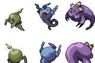
For my own sake, I'm going to take all of your sprites, put them in a grid and number them for convenience. So you know which one I'm talking about, of course.

Before I go with one-on-one sprite attention, I have to say that all of your sprites have mostly the same flaws. They have little to no black outline, too many colors, odd shading, a crapload of dithering, and their palettes are much too dark. Pokémon sprites have a lot of black outline, very few colors (usually), shading that only comes from the top left, little dithering, and brighter palettes.
Now, to be more specific.
Sprite #1. . Oh boy, where do I start? How about with the color palette choice? The colors are too dark and there seems to be no organized way that you decided to shade it. Pokémon sprites don't have all that much shading to make them seem more anime-esque like they're supposed to be, whereas your sprite looks cartoony. Or worse than cartoony, really. Since you're going for the official style, supposedly, you should stick with simplistic shading. Black outline is a must, especially around the bottom left of the sprite. But the black outlines you did are in the oddest of places, like where the horns meet the head and the top of the back.
Sprite #3, oh dear, oh dear. This one is simply horrific. I don't know whether I should start at the shading or at the concept. I think I'll go with the shading. Why are the spots around the legs left unshaded? And why is there a shaded line in the middle of its chest? There are also no indication of toes whatsoever. The horns are terribly shaded. The outsides of them are shaded yet the insides have nothing? Just look at Tauros's horns or Houndoom's horns. Their shading comes from the middle, not the outside. The outside of the horns should be used for highlighting. Now for the concept. . I only have this to say: Dear God, what is it?
Sprite #6 is that a tongue coming out of its mouth? Or is that the inside of the mouth? And the claws shouldn't be colored in black. If the claws are meant to be black, go a couple of shades lighter than just straight-up black. Same goes for the pattern on its stomach. Also, you were a bit too close to the default MS Paint colors.
Sprite #17's chest outline is all wrong. You made it a shade lighter than the color of its actual chest. No. Bad. And I don't even know what's going on with the tail feathers. I can't tell where the shading is coming from. The light source is coming from the top left, not the bottom.
Sprite #49 has a very, very flat face. You can't even decipher where the snout is coming from. And the way you added the fluff to the tail makes the tail look very tattered and frayed. One more thing: the right ear should be smaller than the left ear.
Sprites #57+58 aren't really all that bad. But the colors you used are awful. I don't care if you got them from GameFreak's actual sprites or not, this was a bad choice on your part to use that palette. It doesn't go with this Pokémon at all.
Sprite #94 shouldn't have highlights all the way near the bottom and shouldn't have any highlights on the right unless it's in the face where the light actually shines. And, again, too much dithering.
Sprite #116, that tongue is terrible. It looks like you added random pixels and hoped no one would notice. If you want to, you can look at Lickitung's backsprite to get an idea of how you can fix that.
For my final thoughts: You need to observe the actual animal you're basing your Pokémon off of, whether it's from a picture or from real life. Make sure you know the anatomy of the creature before you try to sprite it or else it'll wind up looking like Sprite #56. Also, enough with the dithering. You know how to do it; we get it. I'd also suggest you look at actual Pokémon sprites and try to go from there. Practice where you need to put black outline (which is around the bottom right on any part of the Pokémon, normally) and remember that the light source comes from the top left in Pokémon sprites.
If you want me to talk about more of your sprites and how you can improve them, I'll be happy to oblige. Just don't nerdrage if you don't like what I say.