
godo156
All Hail the Glow Cloud
- 69
- Posts
- 13
- Years
- The Night Vale Car Lot
- Seen Feb 2, 2015
Woops I dropped off of the face of this site again. I hope I can change that. Anyway, I present to you a new comic I recently (since yesterday) began.
About Severed Grounds
Severed Grounds (SG) takes place in an alternate pokemon world where the regions are mysteriously levitating in the skies due to unknown as of yet reasons. Because of that, the people had to adapt and develop the technology needed to traverse the skies much earlier. Since then, they have invented engines that run on steam and oxygen, made sky boats, blimps, and planes at a quicker pace than the normal world would have.
SG takes place in the 1980's, a time before Pokeball technology, but after the age of Apricorns. This is the age of Capsules. Pokemon are treated like the other times, some are pets, others tools, others traveling companions and much much more.
Also in this time frame, scientist have developed and mass produced medicine that can unlock the hidden potential of humankind, ranging from simply giving one access to their own little pocket of space to store objects with their mind, to giving the consumer of the medicine the power of fire from their very own fingertips. These are dangerous, though and many do not take the medicine because of the risks of losing sanity or their lives.
The only region not suspended into free air is known as Hoenn. As always, no one really knows why it is the only one left below, but some speculate because of the ties the region has to the earth and the seas...
SG takes place in the region of Voultan, a modern and robust country known for being a famous trade route and pokemon unique only to this land.
Outside of Plot Stuffs, SG is based on my playthrough of Pokemon Sienna, a rather well done hack here on Pokecommunity, and [REDACTED], a fangame also from here that you'll learn the name of when it becomes relevant to the story. So a round of applause to them and the creators, for making awesome fanworks for us to play! I maaaay change some plot things though, sorry if it's not a complete following of the games.
Rules
1. Only one pokemon can be caught in an area/route
a. Dupes clause in effect
2. If a pokemon faints, it is considered dead and must be sent away to a box
3. All pokemon must be nicknamed.
Warnings
This comic contains:
-Swearing
-Violence
-Blood
-Shenanigans
-LGBTQA themes
-Steampunk and related -punk themes
-Religion
-Alcohol
-Etc.
-And more shenanigans
You have been warned.
The Comic
(Pssst, the pages may be large. I apologise they were not so big to me when I was drawing and I am afraid resizing will reduce quality)
Part One
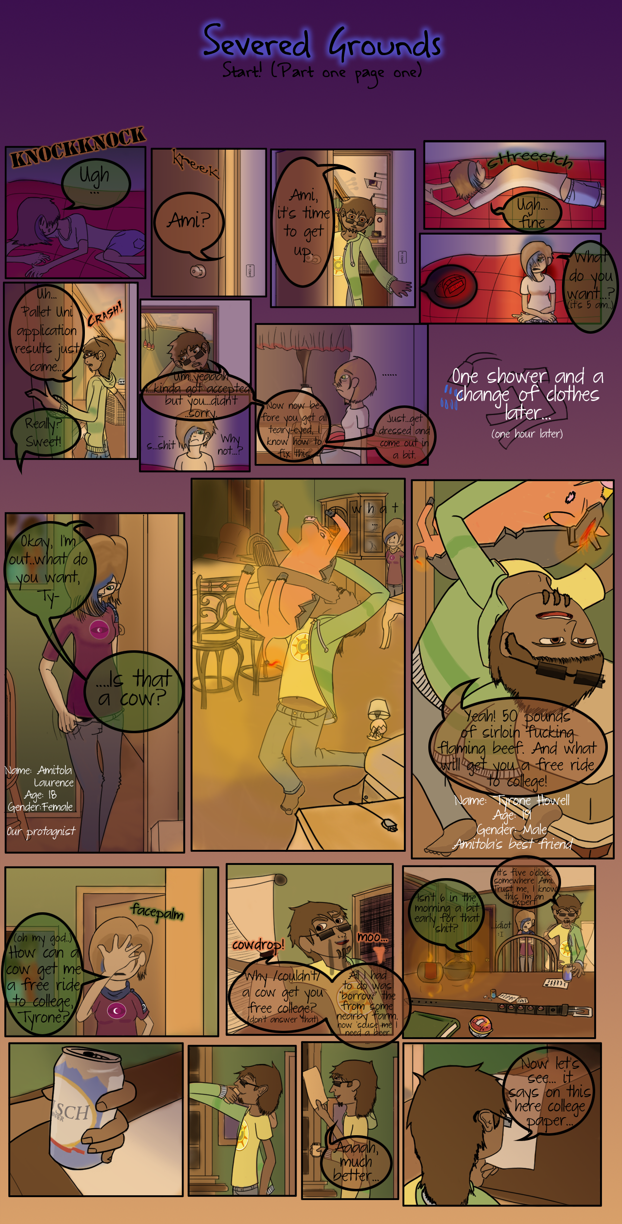
Page One
Bonus doodles and etc arts:
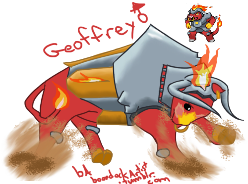
Thoooough things have changed and will most likely change, this was my concept doodle of the fire starter's final evolution, the male form anyway (though female isn't much different besides like lack of the horns or more like stubs, and having an udder), along with the in-game sprite made by the creator of the hack, for comparison.
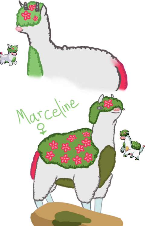
Fllllowwery fluffy llama-sheep-alpaca-thingy and it's evolution.
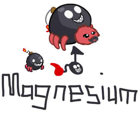
Lil' cute bomb bug (that I tried my best not to be like Kynim's Andy from her Myths of Unova comic :x )

Aaand a plain old Tailow.
These doodles aren't so much spoilers for later game stuff as they are just concepts involving an attempted playthrough of the game...before the save file got corrupted and unplayable. so expect things to change.
Updates will hopefully be onWednesdays and Saturdays once a week until I can get some extra pages done for buffer, then it will go to the originally planned update schedule, but these days are not set in stone because I am not the fastest worker or a person of my word less often than I am one.
Thank you for taking the time to read my ridiculous comic, it means alot, as well as comments, critique and them sorts of things.
Have a good day ouo
About Severed Grounds
Spoiler:
Severed Grounds (SG) takes place in an alternate pokemon world where the regions are mysteriously levitating in the skies due to unknown as of yet reasons. Because of that, the people had to adapt and develop the technology needed to traverse the skies much earlier. Since then, they have invented engines that run on steam and oxygen, made sky boats, blimps, and planes at a quicker pace than the normal world would have.
SG takes place in the 1980's, a time before Pokeball technology, but after the age of Apricorns. This is the age of Capsules. Pokemon are treated like the other times, some are pets, others tools, others traveling companions and much much more.
Also in this time frame, scientist have developed and mass produced medicine that can unlock the hidden potential of humankind, ranging from simply giving one access to their own little pocket of space to store objects with their mind, to giving the consumer of the medicine the power of fire from their very own fingertips. These are dangerous, though and many do not take the medicine because of the risks of losing sanity or their lives.
The only region not suspended into free air is known as Hoenn. As always, no one really knows why it is the only one left below, but some speculate because of the ties the region has to the earth and the seas...
SG takes place in the region of Voultan, a modern and robust country known for being a famous trade route and pokemon unique only to this land.
Outside of Plot Stuffs, SG is based on my playthrough of Pokemon Sienna, a rather well done hack here on Pokecommunity, and [REDACTED], a fangame also from here that you'll learn the name of when it becomes relevant to the story. So a round of applause to them and the creators, for making awesome fanworks for us to play! I maaaay change some plot things though, sorry if it's not a complete following of the games.
Rules
Spoiler:
1. Only one pokemon can be caught in an area/route
a. Dupes clause in effect
2. If a pokemon faints, it is considered dead and must be sent away to a box
3. All pokemon must be nicknamed.
Warnings
Spoiler:
This comic contains:
-Swearing
-Violence
-Blood
-Shenanigans
-LGBTQA themes
-Steampunk and related -punk themes
-Religion
-Alcohol
-Etc.
-And more shenanigans
You have been warned.
The Comic
Spoiler:
(Pssst, the pages may be large. I apologise they were not so big to me when I was drawing and I am afraid resizing will reduce quality)
Part One
Spoiler:
Page One
Spoiler:
Bonus doodles and etc arts:
Spoiler:
Thoooough things have changed and will most likely change, this was my concept doodle of the fire starter's final evolution, the male form anyway (though female isn't much different besides like lack of the horns or more like stubs, and having an udder), along with the in-game sprite made by the creator of the hack, for comparison.
Fllllowwery fluffy llama-sheep-alpaca-thingy and it's evolution.
Lil' cute bomb bug (that I tried my best not to be like Kynim's Andy from her Myths of Unova comic :x )
Aaand a plain old Tailow.
These doodles aren't so much spoilers for later game stuff as they are just concepts involving an attempted playthrough of the game...before the save file got corrupted and unplayable. so expect things to change.
Updates will hopefully be on
Thank you for taking the time to read my ridiculous comic, it means alot, as well as comments, critique and them sorts of things.
Have a good day ouo
Last edited:
