• Our software update is now concluded. You will need to reset your password to log in. In order to do this, you will have to click "Log in" in the top right corner and then "Forgot your password?".
  • Welcome to PokéCommunity! Register now and join one of the best fan communities on the 'net to talk Pokémon and more! We are not affiliated with The Pokémon Company or Nintendo.

A Place to show off Your Custom Title Screens

Flandre Scarlet

Free your mind.
  • 356
    Posts
    16
    Years
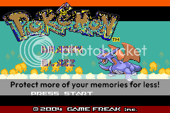
    This is my Title screen. Pokemonrespriter and I put it together. I could use some help with the words and background though.

    A Place to show off Your Custom Title Screens

    Ok. I'm going to start off with the text.
    The text is absolutely, absolutely, horrible. I'm sorry, but it's all messed up, and parts of it is transperant. The "Dragon Blaze" logo is poorly created and doesn't look that well either...

    Next is the Salamence.
    I don't like the R/S/E/FR/LG sprite of Salamence. IMO, it looks... odd kinda. And plus, using a 64x64 sprite for titlescreens are too small. It is also too high, and you can see the gap where the fire in the background doesn't go.

    My rating: 0.35/10. Sorry, but you should follow a tutorial, or ask a friend or something.
     

    Nodddy

    Banned
  • 9
    Posts
    14
    Years
    • Seen Apr 22, 2011
    This is just a mock-up, but if I could still get your thoughts:


    BlitŻ1

    guahh my dog is so cute
  • 472
    Posts
    15
    Years
    This is just a mock-up, but if I could still get your thoughts:


    It looks excellent, but it would rather be an 80s TV special than a pokemon game. But, from experience, full screen title screens don't look that good and a border should be added on the top and bottom
     

    Nodddy

    Banned
  • 9
    Posts
    14
    Years
    • Seen Apr 22, 2011
    It looks excellent, but it would rather be an 80s TV special than a pokemon game. But, from experience, full screen title screens don't look that good and a border should be added on the top and bottom
    Oh good, that's what I was going for. xD

    I'll add some black bars and see what that looks like, I'm not sure though because there's already more scenery covered than I'd like. :/

    And thanks simdu~
     

    HackMew

    Mewtwo Strikes Back
  • 1,314
    Posts
    17
    Years
    • Seen Oct 26, 2011
    I'll add some black bars and see what that looks like, I'm not sure though because there's already more scenery covered than I'd like. :/

    I agree on the bars, just don't make them too big nor too small, and if possible, make them the same height. Another thing. If I were you, I would move the "Tale of the Swamp Field" text some pixels down, because it's too close to the Pokémon logo right now. Oh, I would make the text a bit smaller too.
     

    NTA

    Where?
  • 264
    Posts
    16
    Years
    • Seen Feb 10, 2012
    yay another titlescreen :D
    A Place to show off Your Custom Title Screens

    i honetly thought i wouldnt make anymore =\
    lol and somehow i double posted wtf
    i also think i shoulldve put the logo in the middle lol
     
    Last edited:

    BlitŻ1

    guahh my dog is so cute
  • 472
    Posts
    15
    Years
    yay another titlescreen :D
    A Place to show off Your Custom Title Screens

    i honetly thought i wouldnt make anymore =\
    lol and somehow i double posted wtf
    i also think i shoulldve put the logo in the middle lol

    Yeah, the logo should be put in the middle, it just doesn't look that good with two sprites on both sides if the logo isn't centered. However, I think the c2010 NTA looks a little shabby and you should lower the black bars by make 4 pixels or even 8, it look a tad to big =__=

    And, without further ado, I present me and my partners titlescreen for Pokemon Saturn:
    A Place to show off Your Custom Title Screens

    Credits to: Ben., Spriter's resource, and an unknown author for the fake :P

    And here's another for our second hack that we hold mutually, Pokemon Rimor Dephrensio:
    A Place to show off Your Custom Title Screens

    Credits to : Ben., Spriter's resource

    Any comments?
     

    Tropical Sunlight

    The Faltine
  • 3,476
    Posts
    16
    Years
    Yeah, the logo should be put in the middle, it just doesn't look that good with two sprites on both sides if the logo isn't centered. However, I think the c2010 NTA looks a little shabby and you should lower the black bars by make 4 pixels or even 8, it look a tad to big =__=

    And, without further ado, I present me and my partners titlescreen for Pokemon Saturn:
    A Place to show off Your Custom Title Screens

    Credits to: Ben., Spriter's resource, and an unknown author for the fake :P

    And here's another for our second hack that we hold mutually, Pokemon Rimor Dephrensio:
    A Place to show off Your Custom Title Screens

    Credits to : Ben., Spriter's resource

    Any comments?
    I think the background of Satrun looks a bit too pixellated, like there's too much dithering.
    But both look very professional, maybe you could also include a Pokemon or 2 on them?
     

    Ben.

    Orange I s l a n d s~
  • 623
    Posts
    14
    Years
    I think the background of Satrun looks a bit too pixellated, like there's too much dithering.
    But both look very professional, maybe you could also include a Pokemon or 2 on them?
    I see what you mean, I'll remake it for kyle.
    Thank you, I was maybe thinking about adding in some fakemon, but not sprites
    Little things half of the body type thing, Like in HG/SS location art, Here
     

    BlitŻ1

    guahh my dog is so cute
  • 472
    Posts
    15
    Years
    Hey this is my T-screen for my hack :]
    A Place to show off Your Custom Title Screens

    Your title screen is okay. I give it a basic rating of 4-5/10. This is for several reasons, which may or may not be derived from my own opinion. First, your background should have horizontal borders on the top and bottom, as full screen title screen's do not look good in game, and in this case, your title screen. You should also add a press start in center, as well as centering the pokemon text. Now, on to the background. It is pretty non-descript, lacking overview of the game or any sort possessive thought of a theme. The view is mostly taken up by the trees, which are pretty boring :/and the bottom is cut off (I think) The pokemon should make more of a scene, it took me a couple of seconds to notice it. I think you should get a different and bigger picture to go in the place.

    Now, here's my own redone title screen for Pokemon Saturn :D. I like it when Ben gives me purdy pictures for me to insert. :3

    A Place to show off Your Custom Title Screens


    A great upgrade indeed! :D Rates and criticism please?
     
    Last edited:

    DreadWaffle

    LOVE AND PEACE!
  • 165
    Posts
    14
    Years
    well blitz, you made a screen that doesn't look pixelated at all!
    high points
    -Realistic looking
    -Palette works
    -Centered text + Custom text is executed extremely well for copying the font
    -Fakemon matches the overall theme
    lower points
    -Maybe a little too much going on in the background

    Overall 9.3/10
    would have been nice if you did a palette change on the "Pokemon" set
     

    BlitŻ1

    guahh my dog is so cute
  • 472
    Posts
    15
    Years
    well blitz, you made a screen that doesn't look pixelated at all!
    high points
    -Realistic looking
    -Palette works
    -Centered text + Custom text is executed extremely well for copying the font
    -Fakemon matches the overall theme
    lower points
    -Maybe a little too much going on in the background

    Overall 9.3/10
    would have been nice if you did a palette change on the "Pokemon" set


    Oooh, thanks for making me feel good :D. But all credit goes to Ben. for getting me the background, and the text, and the fakemon, xD. He's such a great partner :3

    We actually plan to palette edit the Pokemon logo later on, After we figure out how we're going to get along doing that >.<. Although, I don't know how I'm going to fix the lower points though xD. Thanks for the review Dread Waffle ^-^
     

    Bolens

    Soul Hacker
  • 359
    Posts
    14
    Years
    • Age 30
    • PA
    • Seen Aug 22, 2016
    Here's my title-screen. I'm just starting out, and I can't edit the text for now, but a decent start. Criticism welcomed.
    A Place to show off Your Custom Title Screens


    Buizark

    Always looking for an OU match
  • 72
    Posts
    14
    Years
    • Seen Aug 5, 2016
    First center the text then get a bigger arcanine sprite.The background is good.Put black bars on the top and bottom.Full screen title screens don't look good in-game.Then get rid of the unneeded pixels
    7.5/10
     

    Maco

    learning the ropes...
  • 72
    Posts
    14
    Years
    A Place to show off Your Custom Title Screens


    Made for a hack I will probably never finish, although I've got some good ideas for the storyline, tilesets, etc. Background is a re-coloured screen from one of the intro/credits movies, the alien pod thingy is from scratch.

    And yes the only fakemon will be facehuggers and Giger's alien.
     
    Back
    Top