• Our software update is now concluded. You will need to reset your password to log in. In order to do this, you will have to click "Log in" in the top right corner and then "Forgot your password?".
  • Welcome to PokéCommunity! Register now and join one of the best fan communities on the 'net to talk Pokémon and more! We are not affiliated with The Pokémon Company or Nintendo.

Map Rating/Review Thread

Status
Not open for further replies.

Muffin™

Knows your age
429
Posts
14
Years
  • ROM Name: Firered
    ROM Hack: Pokemon CrystalClear
    Name: Route 1
    Comment: I thought this was a pretty good map for the first route, because it's on an island so...

    Spoiler:
     

    Darkest Shade of Light

    Pokémon Midnight Sun
    298
    Posts
    14
    Years
  • ROM Name: Firered
    ROM Hack: Pokemon CrystalClear
    Name: Route 1
    Comment: I thought this was a pretty good map for the first route, because it's on an island so...

    Spoiler:
    I'll give it about 9/10, it seems very natural and all, I like the tiles and palettes, but there are a few one-tile-wide pathways that I've seen people get marked down for before, so I'm gonna do the same. I also see a small tile error at the bottom, where the little building is. Look closely at the entrance/exit, there is dirt between the door thingy and the main building. As well as a tile error about 6 tiles left of the stairs, the stone spire thingy has an incorrect background and it messes up the mountain. Soooo, 9/10
     
    5,814
    Posts
    16
    Years
    • Age 30
    • Seen May 19, 2021
    Citrine City:
    citrinecity.png
    Rating yours, because the others aren't worthy of being rated by me.

    Okay, first off, this map is beautifully shaped; tree and mountain tiles. There is a perfect amount of flowers, empty space is good, but maybe a bush/rock or two near the mountain tiles, but it fits in well with that starting map sort of feeling. The paths have a great shape to them as well. Besides the one tile error Chimchar 9 pointed out, there are a few shading errors; unless you meant for most of those to be like that. I won't deduct points for that one accidental tile error and i never take away points from tree shading errors unless there are like, a lot of them n' stuff.

    So, overall rating: 9.7/10
    Thumbs up, bro. (b'-')b
     

    Ninja Caterpie

    AAAAAAAAAAAAA
    5,979
    Posts
    16
    Years
  • Actually, simdu, it's the second town. =|

    Alright, I'm going to get off my butt and do something...did something.

    Spoiler:

    Route 102. There will be trainers.

    To me it doesn't feel Nintendo enough. Sure, there's a pond with a hidden item, but there's only one ledge! D=
     
    387
    Posts
    14
    Years
  • Map name: Silver Cave.
    Game: Fire Red.
    Mapshot:
    Spoiler:

    Comments: I really work hard on this map and it took me very long time to make this map. It is a map of my hack "Shadow of Darkness". Lugia will be here in my hack. It is a complete map. I think there is something wrong but can't find it. Please tell me, any one?
     
    Last edited:

    colcolstyles

    Yours truly
    1,588
    Posts
    15
    Years
  • Actually, simdu, it's the second town. =|

    Alright, I'm going to get off my butt and do something...did something.

    Spoiler:

    Route 102. There will be trainers.

    To me it doesn't feel Nintendo enough. Sure, there's a pond with a hidden item, but there's only one ledge! D=

    I sure hope there will be flowers, too.

    I see what you mean by "not Nintendo enough". You're getting there but there a few things that could help make it more so. For starters, there's the path on the far right side of the map. It's too squiggly for a Nintendo map but honestly, I think it looks good. For me, at least, mapping has been a challenge of finding the balance between Nintendo mapping and "natural" mapping (or whatever you want to call it) and I think that the sand path is a nice touch. Another thing I noticed is that at times, it will be hard for the player to move. I know what you're thinking: "But Styles! I gave them like four blocks of moving space!". That's true and all but what you neglected to take into account is the direction that the player is moving in. The way that your map is shaped, the player will have to move diagonally which is very annoying to do in a Pokémon game because you have to alternate between up/down and left/right which, though not as bad as trying to navigate down a one-tile-wide path, is still obnoxious. Finally, your tall grass shape isn't very Nintendo-ish but, like the sand path, I like it how it is. Except for the most eastern patch. That one's ugly. :|

    As for tree shadow errors, I can't be bothered to do my usual excruciatingly detailed inspection but I caught few. There's one above the pond on the far right of that line of trees. Also, it looks like you need to do something about the blocks that you used for diagonally-aligned trees. You need to have two that have shadows on the bottom layer and another two that don't have shadows.

    But yeah, nice map overall. :)
     

    sab

    Now too much of a life.
    999
    Posts
    15
    Years
  • Map Name: Shroom cave
    Credits: Kyledove and Zein
    Comments:I feel nervous posting right after MoP.Anyway when rating, remember that the top layer doesn't have any rocks on it because it is the roof. This map is not supposed to have been much explored by humans(that should explain the narrow paths and all the little rocks), and there are no border errors in this map so please don't rate down for that.
    Spoiler:
     

    Ninja Caterpie

    AAAAAAAAAAAAA
    5,979
    Posts
    16
    Years
  • I sure hope there will be flowers, too.
    Flowers...yeah. I'll find somwhere to put them in.

    I see what you mean by "not Nintendo enough". You're getting there but there a few things that could help make it more so. For starters, there's the path on the far right side of the map. It's too squiggly for a Nintendo map but honestly, I think it looks good. For me, at least, mapping has been a challenge of finding the balance between Nintendo mapping and "natural" mapping (or whatever you want to call it) and I think that the sand path is a nice touch.
    For me, it's getting the feel of a Pokemon game into the map, with extra areas you can come back to and plenty of ledges and the like. That's what I meant by Nintendo.

    Another thing I noticed is that at times, it will be hard for the player to move. I know what you're thinking: "But Styles! I gave them like four blocks of moving space!". That's true and all but what you neglected to take into account is the direction that the player is moving in. The way that your map is shaped, the player will have to move diagonally which is very annoying to do in a Pokémon game because you have to alternate between up/down and left/right which, though not as bad as trying to navigate down a one-tile-wide path, is still obnoxious.
    =| Good point. You can actually move through the map without it, but it does look like you have to go diagonally...good point again.
    Finally, your tall grass shape isn't very Nintendo-ish but, like the sand path, I like it how it is. Except for the most eastern patch. That one's ugly. :|
    Yes, yes it is. It's horrible.
    As for tree shadow errors, I can't be bothered to do my usual excruciatingly detailed inspection but I caught few. There's one above the pond on the far right of that line of trees. Also, it looks like you need to do something about the blocks that you used for diagonally-aligned trees. You need to have two that have shadows on the bottom layer and another two that don't have shadows.
    Actually, Styles, hehe, I have both of them. I just got a little lazy, xD.

    But yeah, nice map overall. :)
    Thanks for the rate. I still can't really find anything to fix up much with it, but thanks. =P

    @MOP, your map is very nice. The shapes of the mountains and trees are nice, but you'd have some massive border problems and almost every tree is shaded incorrectly. The paths are a nice touch, the ledges too. The water, however, looks a bit awkward. Maybe a little rounder? Some areas are a little tight to walk in, but that should be okay.

    Oh, the flowers! They're in the Emerald colours, aren't they? I should have thought of that!
     
    Last edited:

    Alice

    (>^.(>0.0)>
    3,077
    Posts
    15
    Years
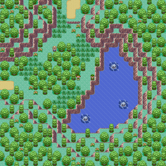
  • For the first time in half a year, I found the inspiration to make another map. As usual, it isn't meant to be played in a real hack, so the areas that the player can't actually see are still meant to look good/ be rated. (Although it is still meant to be playable.)

    Map Name: Crescent Lake

    Map Game: Emerald

    Comments: I'm gonna skip the story behind the map this time, so I can see what you think before hearing me point out the billions of obvious problems. (Although, most of them are just because it's near impossible to make a natural map with Emerald tiles.)

    Spoiler:
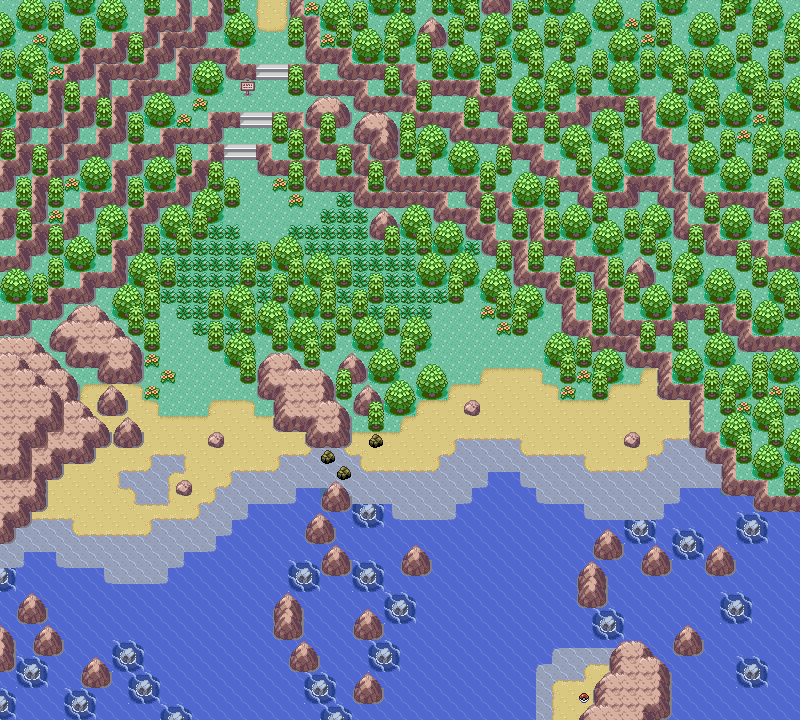
    Map Name: None

    Map Game: Emerald

    Comments: This map is the epitome of just winging it. I originally was thinking I should do a town that you can only enter through the ocean, so I decided to just draw the mountains, and somehow, I ended up with this.
    Ignore border errors, it's not actually going to be used in a hack, so it doesn't really matter. The idea is that you come up by water on the right side, and go north to find a town. When you're done in the area, you go back out by water on the left side. (It looks like the middle set of rocks doesn't keep going, but it does.)

    Mapshot:
    Spoiler:
    Thought I'd repost a couple of mine, as I didn't get any decent rates for either of them. After 3 reposts...

    And now that I think about it, if I were actually going to use the 2nd map, I would have a connection on the left side too, since there's a little... secret water path thingy over there. (In which, I would be able to block off the opening that I left in the shallow water.) And the border on the right would take like 2 seconds to fix.
     
    Last edited:

    monkeybard

    boop
    128
    Posts
    15
    Years
    • Seen Apr 14, 2023
    Map Name: Floaroma Town
    Map Game: Ruby
    Comments: Floaroma Town, Sinnoh, 17 years prior to the events in DPPt. Nothing's really changed, except the Flower Shop used to be a small, home business. Not really sure what mapping style I was going for, just something that is visually appealing [to me at least]. Show no mercy in your review =D
    Mapshot:
    Spoiler:


    Tropical Sunlight

    The Faltine
    3,476
    Posts
    16
    Years
  • Map Name: Floaroma Town
    Map Game: Ruby
    Comments: Floaroma Town, Sinnoh, 17 years prior to the events in DPPt. Nothing's really changed, except the Flower Shop used to be a small, home business. Not really sure what mapping style I was going for, just something that is visually appealing [to me at least]. Show no mercy in your review =D
    Mapshot:
    Spoiler:
    Look at the map shape. It's pure rectangle isn't it? That's never good. I know you were remaking Floaroma Town, so why did you make a new map at all?
    This map is boring. But if you do maps like this for a reason, don't post them to rate it, because you're almost certain to recieve a negative rating.
    For a map, 2/10 because I can't spot any tile errors.
    And for a Floaroma Town remake, 7/10 because it doesn't look very changed.

    Sorry if this isn't what you were hoping to get.
     

    monkeybard

    boop
    128
    Posts
    15
    Years
    • Seen Apr 14, 2023
    Look at the map shape. It's pure rectangle isn't it? That's never good. I know you were remaking Floaroma Town, so why did you make a new map at all?
    This map is boring. But if you do maps like this for a reason, don't post them to rate it, because you're almost certain to recieve a negative rating.
    For a map, 2/10 because I can't spot any tile errors.
    And for a Floaroma Town remake, 7/10 because it doesn't look very changed.

    Sorry if this isn't what you were hoping to get.

    I figured I'd get something as such since I just started mapping [and hacking altogether] and I've seen some of the reviews given in this thread. It was mainly to see the amount of tile errors in it, and see the general public's opinion of it. I notice that it wouldn't be too popular with the better mappers of the forum ._.' And do take note that in the comments it was mentioned that this is seventeen years before the Floaroma we know today in Diamond, Pearl and Platinum. Being the peaceful and relaxing town it is (similar to Verdanturf) I decided that it's not a town to undergo drastic changes over times. But I DID just fiddle with it a bit, added MORE flowers and a few more trees, just to give the player something to look at other than flowers and buildings.
    Spoiler:
     

    Ninja Caterpie

    AAAAAAAAAAAAA
    5,979
    Posts
    16
    Years
  • Actually, simdu, it's the second town. =|

    Alright, I'm going to get off my butt and do something...did something.

    Spoiler:

    Route 102. There will be trainers.

    To me it doesn't feel Nintendo enough. Sure, there's a pond with a hidden item, but there's only one ledge! D=

    Just reposting from the last page. ^^
     
    387
    Posts
    14
    Years
  • Map name: Silver Cave.
    Game: Fire Red.
    Mapshot:
    Spoiler:

    Comments: I really work hard on this map and it took me long time to make this map. It is a map of my hack "Shadow of Darkness". Please this map.
     

    UltramasterBDX

    German Romhacker
    31
    Posts
    15
    Years
  • Map name: No idea ~
    Game: Emerald
    Mapshot:
    Spoiler:

    Comments: I decided to try some new tiles, thats the resultCredits:

    • Alucus
    • WesleyFG
    • Dewitty
    • Zunex
    • Zel!x
    Cheers..
     
    1,619
    Posts
    16
    Years
  • Map name: No idea ~
    Game: Emerald
    Mapshot:
    Spoiler:

    Comments: I decided to try some new tiles, thats the resultCredits:

    • Alucus
    • WesleyFG
    • Dewitty
    • Zunex
    • Zel!x
    Cheers..
    I love the tiles, they go really well together. I like the way you've used both trees. The mountain shape is really nice. The house placement is very well placed. Though I still think the player needs more space to move. I'll give this a 8/10
     
    Status
    Not open for further replies.
    Back
    Top