• Our software update is now concluded. You will need to reset your password to log in. In order to do this, you will have to click "Log in" in the top right corner and then "Forgot your password?".
  • Welcome to PokéCommunity! Register now and join one of the best fan communities on the 'net to talk Pokémon and more! We are not affiliated with The Pokémon Company or Nintendo.

Map Rating/Review Thread

Status
Not open for further replies.

Ninja Caterpie

AAAAAAAAAAAAA
5,979
Posts
16
Years
  • Map Name:Asper Town
    Hack Of:Fire Red
    Time made in:10 minutes
    Author's Comments:The starter town don't really know what i was doing lol
    Credits:OmegaZero for his smexy rom base

    mymap.png
    For the most part, the map is nice. The shape and stuff are pretty good. However, you'd have massive border problems because of the fact that you don't have a full line of trees at the top. The sides are fine because the tree has no shading, but the top will have border errors. Also, you made the house wrong. The door is meant to switch places with the left bottom window. =| The basic map is pretty good though, just fix up those few errors.

    Now, can someone rate my map? :)
    everbloomtown.png

    Name: Evergreen Town.
    Credits:- Neon by creating the base rom and pallets
    - Saurav by Tiles and Pallets
    - WesleyFG by Tiles
    - Xiros by Tiles
    The map is okay, overall. It's kind of plain, but that can be both a good thing and a bad thing; I'll let you decide on that. The middle is a bit empty, maybe add a few flowers there instead of in random spots around the map? Try to also put a few trees outside of the border. Also, try to make your flowers in diagonal bunches, looks much better.

    @Everyone, guys, one rating of a map isn't exactly enough, is it?
     

    Poke-dude

    Pokemon Master
    23
    Posts
    16
    Years
  • Please rate my map? :D
    Map Name: Route 1
    Map Game: Fire Red
    Comments: This map Is based on the original anime series :)
    Mapshot:
    electricyellowroute1.png
     
    Last edited:

    kebengau

    i didn't kill the chikorita:D
    41
    Posts
    15
    Years
  • can u rate this?
    Spoiler:


    Credits for Tiles
    *Kyledove
    *Alistair
    *Alucus of Borg
    *Novus
    *CNC
    *Tododile Empereror
     

    Yusshin

    ♪ Yggdrasil ♪
    2,414
    Posts
    14
    Years
  • can u rate this?
    Spoiler:


    Credits for Tiles
    *Kyledove
    *Alistair
    *Alucus of Borg
    *Novus
    *CNC
    *Tododile Empereror

    It's nice xD but is that Pettleburg or w/e town from Hoenn? Just after Littleroot? It looks like an exact copy, but with different tiles.

    7/10 because it's chibi cute :] but the houses appear to be from different generations, and that rock on the left makes it look weird.
     

    Anselection

    Malicious Mapper
    174
    Posts
    14
    Years
    • Seen Dec 20, 2011
    Map Name: Route 1
    Map Game: Fire Red
    Comments: This map Is based on the original anime series :)
    Mapshot:
    electricyellowroute1.png
    This map looks very, VERY empty. Trees are next to non-existant and you lack a border for half the map. The path looks very odd and man-made, instead of natural. Also, tile errors on the mountains. They end abruptly and when you put the jump down ledges with them, it doesn't looks too good. Also, the grass is very seperate. You can go the entire map without touching grass. What I would do is fix the border, give this map some shape(add trees to make it so you don't simply walk completely straight through the map), Use a different grass tile, since I noticed you used the same one throughout the whole map. Also, you could add grass into groupings, make the path a little more natural looking. And fix the tile errors, then you'll be good to go. Right now, you've got a 2/10.

    can u rate this?
    Spoiler:


    Credits for Tiles
    *Kyledove
    *Alistair
    *Alucus of Borg
    *Novus
    *CNC
    *Tododile Empereror
    I can't really say anything about this map, since it's the second town R/S/E(can't remember the name). If you actually make a map, I'll rate it then. No offense intended, of course.
     

    countryemo

    Kicking against the earth!
    2,367
    Posts
    14
    Years


  • It's nice xD but is that Pettleburg or w/e town from Hoenn? Just after Littleroot? It looks like an exact copy, but with different tiles.

    7/10 because it's chibi cute :] but the houses appear to be from different generations, and that rock on the left makes it look weird.

    Its not an exact copy of Odale Town from Hoenn, I agree abut the rock though.
     

    Binary

    え?
    3,977
    Posts
    16
    Years
    • Seen Apr 7, 2014
    Rating: 5/10
    Reason: First of all, although the map isn't so squarish, the trees are placed in a square pattern. You should really scatter the trees and place them irregularly. There are lots of empty spaces in the map. I don't like the placement of the ledges. The cave looks like squares stacked ontop of each other. I don't like the wide parts of the path. And where are the sides of the trees? Tile error o.0
    Suggestions: You should really scatter the trees and place them irregularly. The lake/pond/whatever is too square. Make it irregular. Use irregular layers for the cave and maybe spread out the cave a little more? Don't make ledges too long and there are tile errors at the sides. Don't make paths wide. It doesn't look good.
     
    Last edited:

    psychicboy

    Hacking is all that matters...
    538
    Posts
    14
    Years
  • Sweet! Just What I was looking for. Super truthful criticisms. Although.. Your criticism(Besides the tile error parts) seem to be based off of pure opinion. Maybe you guys should try to be a bit unbiased in your opinions.

    EDIT: It was a nintendo map for clarity.
     
    53
    Posts
    15
    Years
    • Seen May 14, 2010
    Sweet! Just What I was looking for. Super truthful criticisms. Although.. Your criticism(Besides the tile error parts) seem to be based off of pure opinion. Maybe you guys should try to be a bit unbiased in your opinions.

    EDIT: It was a nintendo map for clarity.

    Mmm, even a Nintendo map looks more packed than that. The grass is meant to be set between the road so that you actually have a chance of beating the first gym and getting through the forests in the 3rd Gen. You can either have a good amount of grass on the roads OR have a good amount of Trainers.
     

    Ninja Caterpie

    AAAAAAAAAAAAA
    5,979
    Posts
    16
    Years
  • There's way too much open space. Way too much of it. There's also a lack of grass. Way too little of it. There needs to be more grass.

    Add two and two together; put more grass in.
     

    Binary

    え?
    3,977
    Posts
    16
    Years
    • Seen Apr 7, 2014
    @Ninja Caterpie:
    Too much grass. If I were playing a hack with a map like that I would be pretty bored. Try to place the trees separately too, so its sort of like a puzzle. The paths are pretty straight forward. I would suggest some paths, perhaps some mountain tiles and two different tree tiles. Overall, pretty nice. 7/10
     

    Matteron (96)

    Can't Read Lookin Ass
    270
    Posts
    15
    Years
    • Seen Feb 13, 2024
    Map Name: Route 1
    Base: Fire Red
    Comments: The mountain was completely free-styled and the map took shape from that. Also, please give me constructive comments.
    Spoiler:
     

    Otter

    Reminiscing Every Now and Then
    46
    Posts
    15
    Years
  • Map Name: Route 1
    Base: Fire Red
    Comments: The mountain was completely free-styled and the map took shape from that. Also, please give me constructive comments.
    Spoiler:

    From a technical standpoint, the map seems to be decent. A quick glance revealed no tile errors (those mountain corners look off though), border errors, or the like. The grass, although a bit too overdone, would force plenty of wild battles (assuming no repels are used).

    My biggest complaint would be the inaccessibility of most of the map. You started with that mountain shape, and you never really evolved past that. The map would be much more interesting if you opened up the beach (and consequently blocked off surf paths) for the player. If you did end up expanding the path to the beach, I'd also suggest adding a few rocks or other misc. tiles to make it less boring.

    Another thing that stands out is how simple the path on that strip of mountain is. The grass is, as I pointed out earlier, overused. Limiting it to a few patches would make the map more fun to play through, in my opinion. Also, the ledge gets a bit narrow in some places, so you might considering widening it.

    Apart from its simplicity, I think it's a decent map. Hope some of my advice helps!
    Final rating: 6.5/10

    You guys post too fast. >:
    I'll do the next one too, then.

    Now, for my maps.

    Name: Wylie Cave Floor 1
    Game: Don't worry about it.
    ROM: Pokemon Fire Red
    Mapshot:
    Spoiler:

    Comments: Simple cave, you enter through bottom right, go through bottom left, appear top of floor 2 re-enter through top left and exit through the top. All criticism is welcomed. Please be polite with your criticism and provide a rating.
    Credits:
    *Gamefreak

    The second map is identical to the first.. if you fix that while I'm making this rate then hurg. Anyway, first thing that jumps out at me is empty space. And lots of it. There's also tile errors the right edge of the map (cliff has the grass base instead of the mountain base). The middle belt of cliffs cuts through the walls on the side, which looks like an error. Same goes for the corners of the map. It also disappoints me that the player can't actually explore all those ledges that you created. They have an interesting shape, so it would be nice if the player could navigate on those somehow.

    I'm pressed for time so I'll cut it short there. I see nothing else terribly wrong anyway. Just those huge patches of empty space in the top left and bottom right. D:
    Final rating: 4.5/10
    (the empty space pretty much kills the map)
     
    Last edited:

    Binary

    え?
    3,977
    Posts
    16
    Years
    • Seen Apr 7, 2014
    @Anselection:
    The maps are identical. The problem with your map that first meets my eye is the empty space in the top left corner and bottom of the map. I think the ocean would have less empty space than that. Those tile errors near the sides and corners don't help. The middle portion of the map is well constructed. The top and bottom parts are very spacey and the tile errors hurt my eyes. The border of the map is squarish. It bugs me.
    5/10
     

    Luck

    ¯\_(ツ)_/¯
    6,779
    Posts
    16
    Years
    • Seen May 20, 2023
    I'm sure that by the end of this post, my sanity will be hanging desperately for its life on a thin thread above the waters of hysteria and the jagged rocks of madness. Well, granted sanity doesn't turn the thread into a lariat to strangle itself upon.

    Map name: Verdi Canyon
    Hack: n/a
    ROM: FireRed
    Comments: Meh, last time I mapped I was having tons of crowding issues in my style. Probably still have 'em. Would be nice to see what else can be commented on, though.
    Spoiler:


    Credits to:
    WesleyFG
    Alistair
    Kyledove
    Nintendo
    I have always liked your maps, and this map is definitely not an exception. The first thing I have to say is that I love all of the tiles you used(except for the log, that's a bit iffy.) The grass that stretches over to the mountain slopes is definitely a nice touch and definitely makes it seem even more like a naturally grassy area. I also liked how some of the grass was pushing against the broken rock tiles, and it's little features like those that make maps that much better. In fact, the only tile error I see(apart from the little edges on the bottom parts of the water that Ninja Caterpie pointed out) was also near the water, but it's a minor thing that I only saw after researching the map a 3rd time for tile errors. The mountains and rocks are nicely placed, but it just seems overdone in that spot above the water. I like the diversity of the trees and even the flowers, but it would be nice if there were a bit more intertwining between the two colored flowers. The grass placement is nice, so I really can't critique you for that D;
    There isn't much else to say about the map other than that the connections are interesting, to say the least, so I'll just end this with an
    8/10
    Ninja Caterpie already said what I thought. It's a bit too big. I hope I'm not the only one who notices the obvious tree shadowing errors though, it's just too bothersome to not take points off. The tall grass is nice I guess, but the placement isn't anything spectacular. The grass paths feel splotchy, and the grass tiles from R/S really make it feel really active, which is a bad thing when you want to make a simple route. It could do with a bit more flowers and even a few small trees, but they shouldn't be priorities. If it weren't so big, it would be significantly better, but it seems a bit too wide(as opposed to too narrow) for a better rating, so you can get a 6.3/10
    Oh, and no problem :3
    Nobody rates my maps, I hope this time someone will. :'<

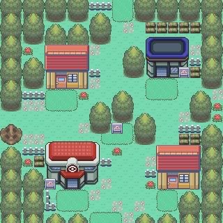
    Name: Limsville Town
    Comments: A starting town map.
    Mapshot:
    Spoiler:
    It seems nice I guess, but it lacks that certain something. The sandy path wouldn't be a problem in this map if it didn't try to completely dominate it. The map is a bit dull, and the grass isn't much better. Only flowers in a certain part of the map, and although I do like random placement, it would be better if you clumped it together in this map. The Emerald trees are a nice touch, and it seems like a good amount to put in, but that doesn't save it I'm afraid. Before I end this, I just need to say that I don't like how the sand path goes into the house instead of stopping in front of it. I don't like it, but some others do apparently so I won't take off points for it. It gets a 6.67/10, and you can take that as a 7 I suppose if you're a fan of rounding.

    Spoiler:

    Tiny Village
    Hack game: Fury Of Shadows
    ROM: FireRed
    Credits: MasterOfPuppets (ROM base)
    Comments:
    A village connected to the first route of my game. The Gym is a training one. two temples are around here. No PokeCenter due to a person that heals your Pokemon. The grass is there to catch some Pokemon (The first route's kinda long, with 3 trainer battles, a tiny bit of grass.) A reference to a series of books, with an upcoming movie, is around here.
    I really don't like this map, although the concept is fine I suppose. The fences as borders are enough to ruin a map, but the numerous rocks in(what I suppose is) a non-rocky map, the one tile wide roads, and the linearity of the lake edges, trees, mountains, and even flowers(you should never use flowers to spell something out) seals its fate. It also alternates from claustrophobic to MMO sized spacey, which is quite bothersome since it just happens immediately. Most of what I suggested is what you can improve upon. If I had to choose one thing to like about the map though, it would be about the tiles. Not only are the tiles nice, but they are diverse, which is a glimmering diamond in the sea of poorly used potential. I'm sorry, but a 1.5/10 is the best I could give you.

    Thanks for the rating Luck, I've changed it according to your criticism, the attachment below is an events pic to demonstrate why there were 1 and 2 tiles paths ;)


    -----

    Name: Same as before
    Base: Same as before.

    (And same credits too).

    <image attached>
    Ooh, you did much better. It's much less linear now, but I still think that one tile path should be extended. It just seems lazy to only make it one tile wide for the sole reason of only needing one cut tree. The river is still nice, but you didn't add any rocks. What's that I see? Different trees? You could've made this map significantly better, but it seems like you're just trying to tease me by giving me a few great looking trees and not peppering them around the map at all. The mountains are still a bit straight, but I won't take away points since they aren't a huge focus. I will add points if you could make it a bit rockier and make the waterfall bigger though, cause for some reason I have a thing for big waterfalls :/
    It's a definite improvement with a few flaws running around, but you get about a 7/10.

    Now, can someone rate my map? :)
    Spoiler:

    Name: Evergreen Town.
    Credits:- Neon by creating the base rom and pallets
    - Saurav by Tiles and Pallets
    - WesleyFG by Tiles
    - Xiros by Tiles
    FFFFFFF simple map. Spread the flowers out a bit more, remove one of the signs in front of the lab(I don't think any building is important enough for 2 signs) and take out a few of the small trees above the lake. It's bothersome for some reason.
    7/10
    Map Name:Asper Town
    Hack Of:Fire Red
    Time made in:10 minutes
    Author's Comments:The starter town don't really know what i was doing lol
    Credits:OmegaZero for his smexy rom base

    Spoiler:

    I just have to say one thing about the houses. YOU'RE DOING IT WRONG. Other than that, the map seems average for a starting town. The sandy paths feel tacked on just to make the grass less empty, the map could do with a few more flowers to make it seem more vibrant, and there will be obvious borders which I usually don't care about, but I have to say that you don't end a map with the top of a tree and grass behind it, you end a map with the top of a tree and another part of a tree behind it. This gets
    6.3/10
    Please rate my map? :D
    Map Name: Route 1
    Map Game: Fire Red
    Comments: This map Is based on the original anime series :)
    Mapshot:
    Spoiler:
    It looks nothing like the anime tbh. There isn't a lake, you don't have to go through any grass, which is kinda absurd considering how big the map is, there are tree shading errors everywhere, the random placement of the grass gets irritating, and the mountains are done just wrong. I'd suggest fixing almost everything in this map except for the tiles, because you can never go wrong with FR/LG.
    1.2/10
    can u rate this?
    Spoiler:

    Credits for Tiles
    *Kyledove
    *Alistair
    *Alucus of Borg
    *Novus
    *CNC
    *Tododile Empereror
    This Oldale cookie cutter town just screams claustrophobia. The fences are unnecessary, it is overcrowded with trees even though it's only 20x20, two of the signs actually go into the mart and center(one of them can't even be read because of the fence,) and the tiles contrast each other. The mart and center suggest a darker atmosphere while the natural tiles make everything look bright and cheery when compared with the center & mart. It's actually bearable and would possibly be a treat if you made the map significantly bigger and thus made it less claustrophobic.
    2/10
    Sure why not. My first time putting a map here. Going for the full criticism's here so be as truthful as possible.
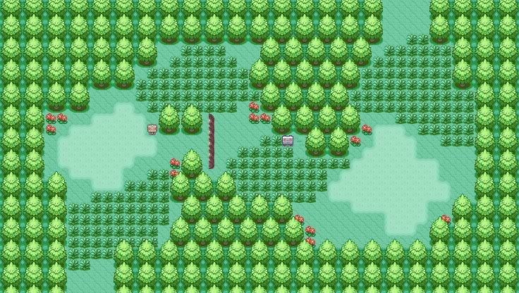

    Map Name: Route 6
    Map Game: Pokemon: Mythic Legends
    Comments: A route map for my hack.
    Mapshot:
    Spoiler:
    Meh, it's dull. It's big, but it's empty. The flowers look a bit dull now that they are around nothing but small grass for most of the map, and it looks like the trees, ledges, and grass paths actually have tile errors despite the map being empty. The whole map is linear, and when mixed with empty, it's just a huge mess. Sorry I couldn't be more specific, but that's just what this whole map is. For some reason though, I like it more than a few of the other maps I saw here.
    3.5/10
    I made a new map; Caterpie Wood! Warning though, it's pretty big.

    Spoiler:
    A bit dull isn't it? You can do so much better, but you continue to make uninspired maps that do no huge favors for you. Recently, you didn't seem to try to cross the line that could make your maps great instead of above average. But onto the map. It's dull. The lack of flowers is somewhat believable since forests are usually dark due to the tree which prevent flowers below from getting necessary nutrients to grow and thrive, but I'm not talking about the biology of flowers. The grass is plentiful and the lake feels tacked on. I do like how you added the forest entrances so it could work for the big trees, but other than that it'll get the exact same 7/10 that all of your other maps got. I'd give it some more points if you made it look like a caterpie, but I was a bit disappointed cause Zubat cave was pretty well done.
    Map Name: Route 1
    Base: Fire Red
    Comments: The mountain was completely free-styled and the map took shape from that. Also, please give me constructive comments.
    Spoiler:
    I completely agree with Otter. I don't think I need to regurgitate what he said. I'd give it a 5/10 only because all of the grass killed the map.
    Name: Wylie Cave Floor 1
    Game: Don't worry about it.
    ROM: Pokemon Fire Red
    Mapshot:
    Spoiler:

    Comments: Simple cave, you enter through bottom right, go through bottom left, appear top of floor 2 re-enter through top left and exit through the top. All criticism is welcomed. Please be polite with your criticism and provide a rating.
    Credits:
    *Gamefreak

    Like everyone said, it's too spacey, which would be acceptable if you called it a cavern, the giant sister of the anorexic cave, but you called it the wrong thing. It may not seem like much, but you'd say "that's not a rainforest" if I posted a forest that had no water whatsoever on it. Tile errors are commonplace among the borders, and it has a severe lack of rocks. You get a few square patches of rocks and you coupled it with that square border and you called it a day.
    That is just…no. It gets a 2.5/10, but only because you put in those small breaches where water seeps in.


    If you don't like your rating, then stop making your maps so flawed :3

    Edit: I meant that last sentence to be directed to everyone. D:
     
    Last edited:
    Status
    Not open for further replies.
    Back
    Top