• Our software update is now concluded. You will need to reset your password to log in. In order to do this, you will have to click "Log in" in the top right corner and then "Forgot your password?".
  • Welcome to PokéCommunity! Register now and join one of the best fan communities on the 'net to talk Pokémon and more! We are not affiliated with The Pokémon Company or Nintendo.

Map Showcase and Review Thread

Status
Not open for further replies.

Rayquaza.

Lead Dev in Pokémon Order and Chaos
702
Posts
12
Years
Back into the mapping scene, here's my first map, the starting town!

No route attached yet but will be soon enough!

It could do with a bit less empty space and a more... organic(?) flow to it. I understand you haven't added an exit yet but the tree line is waaaay too square. If you try and add some to the corners and in different places, maybe add more flowers and some street lamps. Maybe even some benches.

I'd widen the pathways as well. Making them 3 tiles wide just looks better.

I look forward to seeing improvements. Good Luck.
 

TheWanap

Developing: Pokemon: Cursed Time
34
Posts
10
Years
^ I agree with Rayquaza, you shold try to add a dark grey shadow under those houses, besides of where the sun is coming in your game (usually at left corner). Adding fences and benchs isn't bad idea? And NPCs, too.
 

Rayquaza.

Lead Dev in Pokémon Order and Chaos
702
Posts
12
Years
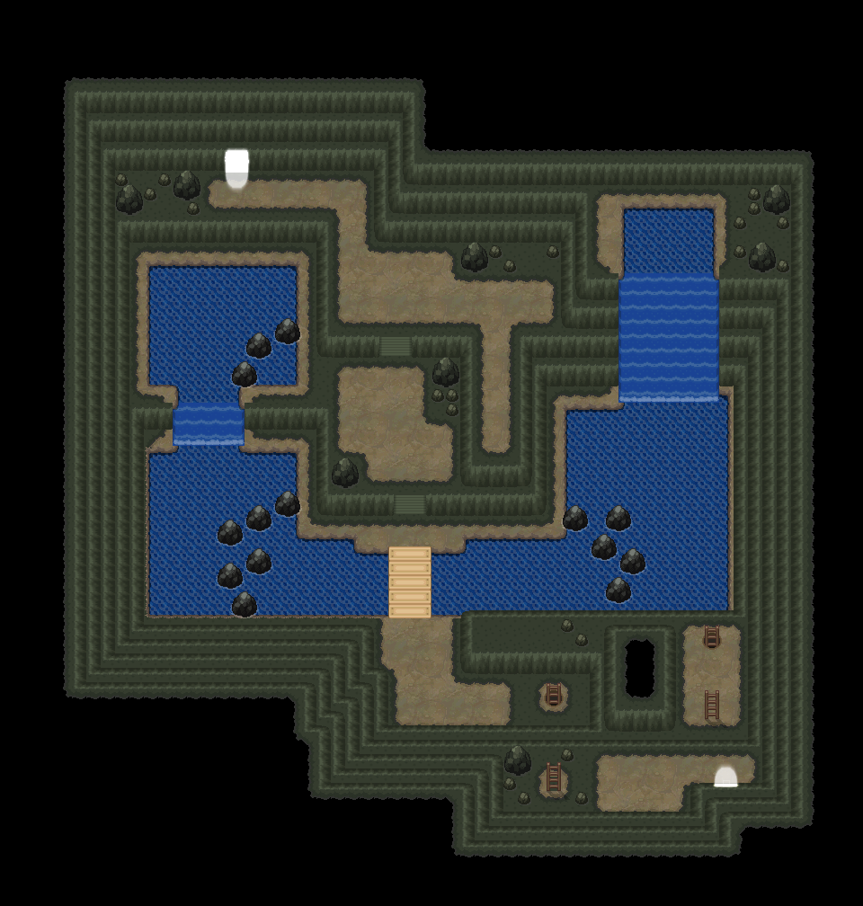
I've recently been tweeking the tiles for my cave maps bit-by-bit and this is the net result:

Spoiler:


More information on the map here.
 
Last edited:

Luka S.J.

Jealous Croatian
1,270
Posts
15
Years
I've recently been tweeking the tiles for my cave maps bit-by-bit and this is the net result:

Spoiler:


More information on the map here.

You just need to adjust the colour/brightness/saturation of the stairs and the bridge. They don't match with the rest of the cave. Oh and the water foam (around the rocks) is too bright as well. Other than that, the colour of the tiles blend nicely.
 

tImE

It's still me, 44tim44 ;)
673
Posts
17
Years
Here's Route 1 from my game, any thoughts?

30c2c1x.png

Hmm, you've got a long way too go.

First off, you can completely avoid going in the wild grass in the northern area.
Furthermore, the area is really boring in general.
There is too much empty space, no real flow in the map and the trees are placed very unnatural.

As of right now, I give this map 4/10.

Move all the trees on the right further left and remove the empty area between the house and the trees.
Then, make the line of trees north of the house 1 tree thicker.
After that, try to restructure the northern area something like this:
Spoiler:


Try to study the official maps more.

You're not a bad mapper, you just need to learn what makes a map boring/interesting, what makes the map easy to remember and/or find your way through.

Good luck!
 

Atomic Reactor

Guest
0
Posts
We're here to provide suggestions, nothing more, nothing less.
He is providing suggestions, he's just not doing it the same way as you do. We all give critique and suggestions in different ways, that's all he's doing. He has credentials to prove that he knows a bit what he's talking about, he's been mapping for ages and gotten pretty good at it.
We all have the right to post our suggestions and feedback, no one is going to critique the same way.
 

tImE

It's still me, 44tim44 ;)
673
Posts
17
Years
Maybe its just me, but I find it really annoying when you rate people's maps.(and tell them what to change) It's completely unnecessary, and really makes you seem self-rightous when no-one here has the credentials to say what the "rules" are for making a great map. Or that we should follow the pokemon games formula to begin with. We're here to provide suggestions, nothing more, nothing less.

Well, it is a REVIEW thread, so I am going to review it based upon what I find aestetically pleasing.
What I think is not a universal truth and should of course not be taken as such, but I don't believe saying "It looks great!" when I personally think it doesn't, will help him improve in any way.

Also, what I tell them to change is just suggestions, once again based upon my own personal opinion.

But everyone, and I mean everyone, make judgements based upon personal subjectivity. No one can be completely objective, which is why it's good to get several peoples opinion. Which this thread is for. I'm just a voice in the crowd, not anyones boss, and my posts should be taken as such.

I'm sad to hear you think I sound self-righteous, though. :<
That is not my intention an all.
I'm just trying to be clear on what I find negative about the map.
And if it's the "#/10" thing you dislike, that's just something that I've continued to do, since my Rom Hacking days, as you had to put a rating in your post in the Map review thread over there.
I could stop, if anyone think it isn't cool for me to do so.
 

WackyTurtle

Developer
124
Posts
13
Years
I'm sad to hear you think I sound self-righteous, though. :<
That is not my intention an all.
I'm just trying to be clear on what I find negative about the map.
And if it's the "#/10" thing you dislike, that's just something that I've continued to do, since my Rom Hacking days, as you had to put a rating in your post in the Map review thread over there.
I could stop, if anyone think it isn't cool for me to do so.

I wouldn't worry, I don't think you sounded self-righteous at all. It's much more useful to hear about what's wrong with your map and how you could improve it than to receive worthless praise. And I agree with the assessment of the map, it's going to need some work to look good - the maps from the Pokémon games are very useful as a starting point to learn about map aesthetics.
 

tImE

It's still me, 44tim44 ;)
673
Posts
17
Years
Yeah, no worries, I mean, I could try to be nicer to the newbies, and you're right.
I provided little to no reason why my "fixes" were good.

I'll be more careful with what I say in the future.
I really don't wanna crash somones hopes to be a mapper, by being too harsh!
 

Rayquaza.

Lead Dev in Pokémon Order and Chaos
702
Posts
12
Years
Are these tiles public? Because I need Cave tiles, and I'm lazy

I'm afraid they're not. Unless your talking about the brown cave floor and small rocks and, no offence, but why are you in game dev if your lazy? I can do more tiles like it but not now cos I'm busy.

Talking of that map I've made adjustments according to feedback and changed some stuff:

Spoiler:
 
Last edited:
28
Posts
10
Years


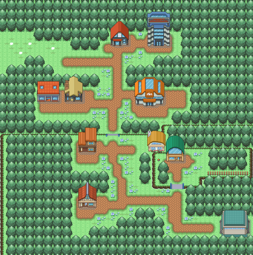
This is the first city in my game tips? I do know that I have to make the shadows darker and the top left is a bit empty. Anything else?
 

Harvey_Create

Pokemon Apex Team Member
187
Posts
11
Years
  • Age 27
  • Iowa
  • Seen Jul 12, 2015
I'm afraid they're not. Unless your talking about the brown cave floor and small rocks and, no offence, but why are you in game dev if your lazy? I can do more tiles like it but not now cos I'm busy.

Well, not LAZY, but I want some placeHolders. Its Okay.
 

Rayquaza.

Lead Dev in Pokémon Order and Chaos
702
Posts
12
Years


This is the first city in my game tips? I do know that I have to make the shadows darker and the top left is a bit empty. Anything else?

The only thing I'd change is the consistency of the paths. It may just be me but The paths look better when they're 3 tiles wide/long. Other than that you've handled the flow and space very well.
 

tImE

It's still me, 44tim44 ;)
673
Posts
17
Years


This is the first city in my game tips? I do know that I have to make the shadows darker and the top left is a bit empty. Anything else?

I think this map is really excellent!

I really love the way you've used the paths.

The only thing I could see improved is the fact that there is a lot of empty space "around" everything.
You could try to add a fence around the entire city, to accomodate this. Or just moving the trees closer where applicable.
Using more "city decorations" like lamp posts, potted plants, railings, benches, etc. could make it better too, in areas like to the right of the gym, to the sout of the mart and to the sout of the yellow roofed house.

I also think the top left area should be resized. The emptiness doesn't really matter, but it way too big of an entrance.
You can almost stand in the middle and not see the north tree or the south tree on the screen. XD

Still, a very good map! Keep up the great work!
 
8
Posts
10
Years
  • Age 33
  • Seen Mar 30, 2017
Hmm so this is the beginning "town" from my game (an airport, actually) - it connects to the bottom end of Route 1 which i posted on the last page i think..

There's a guard to block the player from entering the car-park with lots of vehicles (so those vehicles are really just functioning like the trees on the other edges of the map).

The top left area cannot be accessed by the player.

The planes currently do not have shadow - it'll be fixed at some point..

One thing I was really unsure about was the paths - where should the light grey path end? Where should the sand path end? At the moment I think the sand path next to the airport fences look a bit weird, but removing them leaves the map too empty; and extending the light grey path to right next to the grass seemed weird too (I do want to have some grass in this map).

And is there anything wrong about the map?

Any help/comments is appreciated :)
 
Status
Not open for further replies.
Back
Top