• Our software update is now concluded. You will need to reset your password to log in. In order to do this, you will have to click "Log in" in the top right corner and then "Forgot your password?".
  • Welcome to PokéCommunity! Register now and join one of the best fan communities on the 'net to talk Pokémon and more! We are not affiliated with The Pokémon Company or Nintendo.

Map Showcase and Review Thread

Status
Not open for further replies.

TBM_Christopher

Semi-pro Game Dev
448
Posts
14
Years
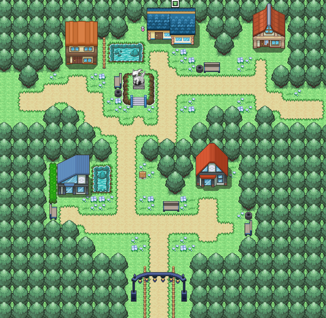
Hmm so this is the beginning "town" from my game (an airport, actually) - it connects to the bottom end of Route 1 which i posted on the last page i think..

There's a guard to block the player from entering the car-park with lots of vehicles (so those vehicles are really just functioning like the trees on the other edges of the map).

The top left area cannot be accessed by the player.

The planes currently do not have shadow - it'll be fixed at some point..

One thing I was really unsure about was the paths - where should the light grey path end? Where should the sand path end? At the moment I think the sand path next to the airport fences look a bit weird, but removing them leaves the map too empty; and extending the light grey path to right next to the grass seemed weird too (I do want to have some grass in this map).

And is there anything wrong about the map?

Any help/comments is appreciated :)

So to address your concern about paths, I think the light grey path looks fine, but you should try to create your own border tile between the light and dark grey for pavement, to make it look more like a curb rather than a drastic change. Finally, the doubly-layered fence between the runway and main exit path seems somewhat jarring. You may have to edit your tiles if you want to keep that aesthetic.
 
8
Posts
10
Years
  • Age 33
  • Seen Mar 30, 2017
So to address your concern about paths, I think the light grey path looks fine, but you should try to create your own border tile between the light and dark grey for pavement, to make it look more like a curb rather than a drastic change. Finally, the doubly-layered fence between the runway and main exit path seems somewhat jarring. You may have to edit your tiles if you want to keep that aesthetic.

Hey thanks a lot! I think the light grey-dark grey path transition looks fine now.. but is it actually?

I've also fixed some tile errors on fences which I apparently failed to note until I zoomed to 800% :P

And for the double fences, I dunno.. I guess I don't see where the problem lies, but then I'm still rather new to mapping so you're probably right. I don't really have an idea as to how to make that look pretty though.. Do you mind giving me any ideas? Or would it be better to just resort to using one-layered fences?

Thanks again!
 

TBM_Christopher

Semi-pro Game Dev
448
Posts
14
Years
Hey thanks a lot! I think the light grey-dark grey path transition looks fine now.. but is it actually?

I've also fixed some tile errors on fences which I apparently failed to note until I zoomed to 800% :P

And for the double fences, I dunno.. I guess I don't see where the problem lies, but then I'm still rather new to mapping so you're probably right. I don't really have an idea as to how to make that look pretty though.. Do you mind giving me any ideas? Or would it be better to just resort to using one-layered fences?

Thanks again!
Glad that helped! It definitely looks better to have that border there. (Personally I might advise making the border a straight edge rather than curvy like that, but to each their own at that point)

For the double fences, I might recommend spriting your own which is something like 1.5 tiles tall; it'll make the barrier more clear between the runway and footpath while keeping the fence looking thicker than the ones used for houses.

Awesome, it really shows that you're putting effort into this map!
 
17
Posts
14
Years
  • Seen Aug 19, 2014
So I finally got back into game making, and while my friends and I were drafting the story I figured I should practice mapping.
After about an hour, here was my results.
Spoiler:

It probably is not something I will use but I still want to improve so any tips would be appreciated.
 

tImE

It's still me, 44tim44 ;)
673
Posts
17
Years
Route 1 for my currently Untitled project. Feedback would be great.


Spoiler:

I really, really like this map!
It's got a very nice flow and the player can easily remember/find their way through it.

What I think would be nice is to move the small patch of the grass, in the bottom, to the left and merge it into the left patch, and add a big "Route sign" in it's place. It'd give the area something "interesting", since it's basically just a straight area right now.

9/10
 

tImE

It's still me, 44tim44 ;)
673
Posts
17
Years
Very nice little village/town.

However, I think the left area looks very boring/empty and the very long roads looks kind of funny.
I think moving the bottom part of the road to break up the map would make it more interesting.
Example:
Spoiler:


You could also try adding some wooden fence in the town to add some details to it. :)
 
1,748
Posts
14
Years
Very nice little village/town.

However, I think the left area looks very boring/empty and the very long roads looks kind of funny.
I think moving the bottom part of the road to break up the map would make it more interesting.
Example:
Spoiler:


You could also try adding some wooden fence in the town to add some details to it. :)

I knew something was wrong here, but I just couldn't find out what to do with it. Thanks a lot!


Edit: Here's the modified map:

View attachment 72087
 
Last edited:

tImE

It's still me, 44tim44 ;)
673
Posts
17
Years
Wow, it looks even better now! :D

You still have some misused tree tiles, though. (The shadows behind the middle part of the tree. There are tiles with and without the shadow. They should be without shadow, when next to grass, and with shadow when next to another tree.)

Great work!
 

WackyTurtle

Developer
124
Posts
13
Years
I've made a city, but I know it can be majorly improved, any suggestions?

Spoiler:

There's too much empty space. Look at your other map, which is really good - it's much tighter, giving a clear path for the player to follow, and very little space is wasted.

With this map you should try to avoid unnecessary gaps between buildings. Bring in the tree line, reduce the distance between the bottom gateway and the gym, and maybe even widen the path to three or four squares to make it seem like more of a developed city than a small town. It's a promising start though. Good luck!
 
1,748
Posts
14
Years
There's too much empty space. Look at your other map, which is really good - it's much tighter, giving a clear path for the player to follow, and very little space is wasted.

With this map you should try to avoid unnecessary gaps between buildings. Bring in the tree line, reduce the distance between the bottom gateway and the gym, and maybe even widen the path to three or four squares to make it seem like more of a developed city than a small town. It's a promising start though. Good luck!

Alright, thanks for the tips I'll see what I can do.
 
17
Posts
14
Years
  • Seen Aug 19, 2014
So I redid the image earlier with a different, and more common style for the trees. If you guys could let me know which version you like better and how to improve it more it would be much appreciated.
Spoiler:
 

TBM_Christopher

Semi-pro Game Dev
448
Posts
14
Years
I like the denser trees towards the edges of the maps, but I prefer how you have the uneven trees at the edge of the path; is there any way you could attempt to compromise between the two styles of tree placement?
 
Status
Not open for further replies.
Back
Top