• Our software update is now concluded. You will need to reset your password to log in. In order to do this, you will have to click "Log in" in the top right corner and then "Forgot your password?".
  • Welcome to PokéCommunity! Register now and join one of the best fan communities on the 'net to talk Pokémon and more! We are not affiliated with The Pokémon Company or Nintendo.

{Tile/Palette Rating Thread}

Status
Not open for further replies.

Logan

[img]http://pldh.net/media/pokecons_action/403.gif
10,417
Posts
15
Years
  • Map name: Poképlaza entrance
    Mapshot:
    Spoiler:

    Credits: cuddlesthefatcat
     

    Banjora Marxvile

    hOI!!!!!! i'm tEMMIE!!
    3,496
    Posts
    16
    Years
    • Age 30
    • Seen May 13, 2024
    @Manipulation

    That is impressive, and big. Shame it takes a lot of tiles, really, but oh well. It is stunning, a good choice of pallettes as well. Nicely inserted, but I fear the oor doesn't suit the FR/LG style. It probably will in game, but animations for that would be harder than normal (as you need a Ruby sized animation). Oh, and surely that is shadow overkill around the bottom. It shouldn't have that square a shadow. Overall:

    Tiles: 9/10
    Pallette: 10/10

    Now for mine. I never really got them rated here, only by friends a while ago, so...

    Spoiler:


    Credits: Floor - SEGA (From the Sonic 2 Beta Casino Night Zone)
     

    lalo0101

    Thanks Mulczhar for Avatar:D
    62
    Posts
    14
    Years
    • Seen Mar 17, 2013
    well heres my lates 2 tile please rate
    hg ss mountain
    {Tile/Palette Rating Thread}


    random house
    {Tile/Palette Rating Thread}

    i know pals a bad
     
    Last edited:

    Matteron (96)

    Can't Read Lookin Ass
    270
    Posts
    15
    Years
    • Seen Feb 13, 2024
    @Matteron, Thanks.. and no I dont understand exactly wat ur saying :S
    Sorry for replying so late, but I have been gone for two months ^^'
    Anywho, what I meant is that the center of the flowers are black, which is not a normal color for pollen that you would see in flowers like those.
     
    102
    Posts
    14
    Years
    • Seen May 19, 2010
    well heres my lates 2 tile please rate
    hg ss mountain
    {Tile/Palette Rating Thread}


    random house
    {Tile/Palette Rating Thread}

    i know pals a bad
    The HG/SS Mountain seems fine, But I have a little problem with the random house. I think you should fix the roof what I can see in it is that it's like plain and doesn't have a unique shape other than rectangle. The palette colors seems fine. 9/10
     

    Matteron (96)

    Can't Read Lookin Ass
    270
    Posts
    15
    Years
    • Seen Feb 13, 2024
    {Tile/Palette Rating Thread}

    They are alistairs's tiles and the palette is a slightly modified version of alistair's as well. Tell me what you think.
    Also, if anyone knows how to edit water animations please pm or vm me.
     

    simdu68

    asleep all summer zzZZ
    218
    Posts
    14
    Years
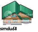
  • just posting 2 new houses made by me, I want to know what you think about it


    {Tile/Palette Rating Thread}


    {Tile/Palette Rating Thread}


    on the second pic don't pay atention on the colours nearby, I done it jst for me for a better overview of the pallette^^
    if not you can see that they are the same style, yeah both houses have the same base that's why^^
    anyway, plz rate tile itself and pallette, thx :)


    sorry for the double post but I posted them already nearly one month ago and these tiles haven't yet been rated, it really hurts me :(
    can someone plz rate? thx :)
     
    Last edited by a moderator:

    altariaking

    Needs NO VMs...
    1,087
    Posts
    14
    Years
  • {Tile/Palette Rating Thread}

    the reason there are so many pokemon centres and marts is because i couldn't decide which was best. you see, i like the sign at the side...then again, i like it under the window too...but which is better? there's only one way to find out, RAAAAAATTTTEEEEE!!!!!
     

    simdu68

    asleep all summer zzZZ
    218
    Posts
    14
    Years
  • my tile 3 posts above yet hasn't been rated! plz rate, thx :)

    BTW I have another tile I want you to rate:
    {Tile/Palette Rating Thread}


    plz rate this one and my 2 houses above!! thx :)


    edit:


    credit to alucus for having used the border of the water of one of his tiles^^

    but this tile is gonna be changed, it isn't the final version of my tile, I did it just for now like this....
     
    Last edited:

    Banjora Marxvile

    hOI!!!!!! i'm tEMMIE!!
    3,496
    Posts
    16
    Years
    • Age 30
    • Seen May 13, 2024
    my tile 3 posts above yet hasn't been rated! plz rate, thx :)

    BTW I have another tile I want you to rate:
    {Tile/Palette Rating Thread}


    plz rate this one and my 2 houses above!! thx :)

    Patience is a virtue. A month is nothing, I posted mine before you did, still no rating!

    Anyway:

    @simdu: I have already said good things about your houses on MSN, if I recall, the only bad thing I can see is the outline is too thick, and shouldn't be black, they get a 9/10 on design, 7/10 on pallette. (That pesky outline!)

    Your recent ones look great, but I can't really rate them too much. I'm not a fan of those sorts of tiles, so I feel I would only be biased.I will suggest making the wall of the water edge a but less square shaped, and more rounded, as water erodes things into a circular shape, just to add a more natural feeling. (I'll rate... 8/10 for both tiles and pallettes - nice work on the water pallette by the way!)


    @altariaking: Shading is a bit off. You may need to look at shading again, as it seems more 2D than Pokemon tiles normally are. You wanted the best one to use? None, as they are not ready because of the shading. The roof is shaded incorrectly as well (not an insult, as shading are hard to do).

    As it makes no difference where the sign goes (as it is your tile, you decide where to put it), I will rate them all equal - tiles get a 7/10 (as the shape of them is good, but the roof could do with a smoother shape, as towards the back, it looks kinda rough), and pallettesget a 6/10
     

    lalo0101

    Thanks Mulczhar for Avatar:D
    62
    Posts
    14
    Years
    • Seen Mar 17, 2013
    {Tile/Palette Rating Thread}

    the reason there are so many pokemon centres and marts is because i couldn't decide which was best. you see, i like the sign at the side...then again, i like it under the window too...but which is better? there's only one way to find out, RAAAAAATTTTEEEEE!!!!!
    well the pals are ok but the tiles themselves need some work like the shading and the pattern for the pattern dont jitter.
    4/10
    my tile 3 posts above yet hasn't been rated! plz rate, thx :)

    BTW I have another tile I want you to rate:
    {Tile/Palette Rating Thread}


    plz rate this one and my 2 houses above!! thx :)

    well you showed good pals but you should use the whole mountain instead of halve and dont forget to give credit to alucus
    7/10


    now my turn
    well heres my custom black and white house
    {Tile/Palette Rating Thread}

    you can use it if you want but you have to give credit!
     
    Last edited:

    simdu68

    asleep all summer zzZZ
    218
    Posts
    14
    Years
  • Patience is a virtue. A month is nothing, I posted mine before you did, still no rating!

    Anyway:

    @simdu: I have already said good things about your houses on MSN, if I recall, the only bad thing I can see is the outline is too thick, and shouldn't be black, they get a 9/10 on design, 7/10 on pallette. (That pesky outline!)

    Your recent ones look great, but I can't really rate them too much. I'm not a fan of those sorts of tiles, so I feel I would only be biased.I will suggest making the wall of the water edge a but less square shaped, and more rounded, as water erodes things into a circular shape, just to add a more natural feeling. (I'll rate... 8/10 for both tiles and pallettes - nice work on the water pallette by the way!)


    @altariaking: Shading is a bit off. You may need to look at shading again, as it seems more 2D than Pokemon tiles normally are. You wanted the best one to use? None, as they are not ready because of the shading. The roof is shaded incorrectly as well (not an insult, as shading are hard to do).

    As it makes no difference where the sign goes (as it is your tile, you decide where to put it), I will rate them all equal - tiles get a 7/10 (as the shape of them is good, but the roof could do with a smoother shape, as towards the back, it looks kinda rough), and pallettesget a 6/10


    thanx for rating :)
    I'm sorry for your tile, I'll edit the post to rate it when I find it ;)

    well the pals are ok but the tiles themselves need some work like the shading and the pattern for the pattern dont jitter.
    4/10


    well you showed good pals but you should use the whole mountain instead of halve and dont forget to give credit to alucus
    7/10


    now my turn
    well heres my custom black and white house
    {Tile/Palette Rating Thread}

    you can use it if you want but you have to give credit!


    ehm....I admit that I came on the idea of making transparent water by seing alucus's tile but it is completely scratched the one I did, BTW I first did it for WHISBIII (or something similar) because he asked me, so....you mean that I need to give credit to alucus because I came on the idea of making transparent water when seeing his water and I should maybe also give credit to WHISBIII because he asked me and if he didn't I would never create this tile, right? lol^^
    ok I can also do it

    credits:

    Alucus - giving me the idea
    WHISBIII - asking me to do it


    happy like this? xD


    well, now your tile.....
    the tile is nice, but when I see it I kinda have the feeling it is too high, maybe it isn't enough bright or long that's why it seems so high and I don't really like, but well, maybe it is just my preference so I can't really judge it, if not the pallette isn't good, there is a too big contrast of the colours, the light blue of the roof, then yellow walls and the dark brown balk?(I'm not sure if its the right word, I'm bad in english^^)
    these colours don't really fit
    rating:

    tile - 8.5/10
    pallette - 6/10


    don't be dissapointed the tile is really good(though it could be better^^) but what I don't like is the pallette


    edit:

    I saw your last tiles banjora, the casino tiles.....there are not many tiles which have changed from the original but.....I'll still rate ;)

    so, the floor is really nicely done, it has the same style as the other tiles of the casino so it really fits nicely, if not it is also better than the original floor tiles coz it is more fitting for a casino wich the signs on them.....the colours also is good, it also fits to the other tiles of the casino.......
    well, in fact it is the only change I found^^
    and I also found nothing negativ, only positiv ;D

    rating:
    tile - 10/10
    pallette - 10/10
     
    Last edited:

    locoroco

    Ginga Densetsu Weed ANIME PWNS
    251
    Posts
    14
    Years
  • here is my first tile eva tell me on what to improve

    {Tile/Palette Rating Thread}


    rate it on everything pallete and everything also this is supposed to recreate the wooden house in azalea town in hgss

    also here is a custom plasma screen tv
    {Tile/Palette Rating Thread}

    rate it also rate in on shape and realism
     
    Last edited:
    114
    Posts
    14
    Years
    • Seen May 7, 2012
    here is my first tile eva tell me on what to improve

    {Tile/Palette Rating Thread}


    rate it on everything pallete and everything also this is supposed to recreate the wooden house in azalea town in hgss

    also here is a custom plasma screen tv
    {Tile/Palette Rating Thread}

    rate it also rate in on shape and realism

    I might sound a little harsh, but the roof doesn't look great. If you have to try to use the huts from Pacificlog Town in R/S/E instead.

    the door looks like a refrigerator

    TV is great though, but how big is it actually? Do you have a screenshot for comparison?
     

    locoroco

    Ginga Densetsu Weed ANIME PWNS
    251
    Posts
    14
    Years
  • around that 53x39 i can make it bigger though i think i make better indoor tiles than outside tiles ill stick to indoor tiles ill see if i can make a new tile and ill post it later ill see if can make a new computer you can use the plasma screen tile if you want you dont have to give credits but i would love some XD.
     

    Bolens

    Soul Hacker
    359
    Posts
    14
    Years
    • Age 30
    • PA
    • Seen Aug 22, 2016
    here is my first tile eva tell me on what to improve

    {Tile/Palette Rating Thread}


    rate it on everything pallete and everything also this is supposed to recreate the wooden house in azalea town in hgss

    also here is a custom plasma screen tv
    {Tile/Palette Rating Thread}

    rate it also rate in on shape and realism

    So, with constructive criticism, the house needs to have a more definite shape. The roof looks like it is just laying on top of the framework, and the door is a little to high. If following the Azalea Town house, it looks similar, it just needs to be defined more in shape and palletes. TV screen is nice, could use some more framework, but overall not bad. Not bad for first time. :classic:
     
    Status
    Not open for further replies.
    Back
    Top